DOCTENA
— SECTOR
Healthcare Platform
— TARGET USERS PORTALS
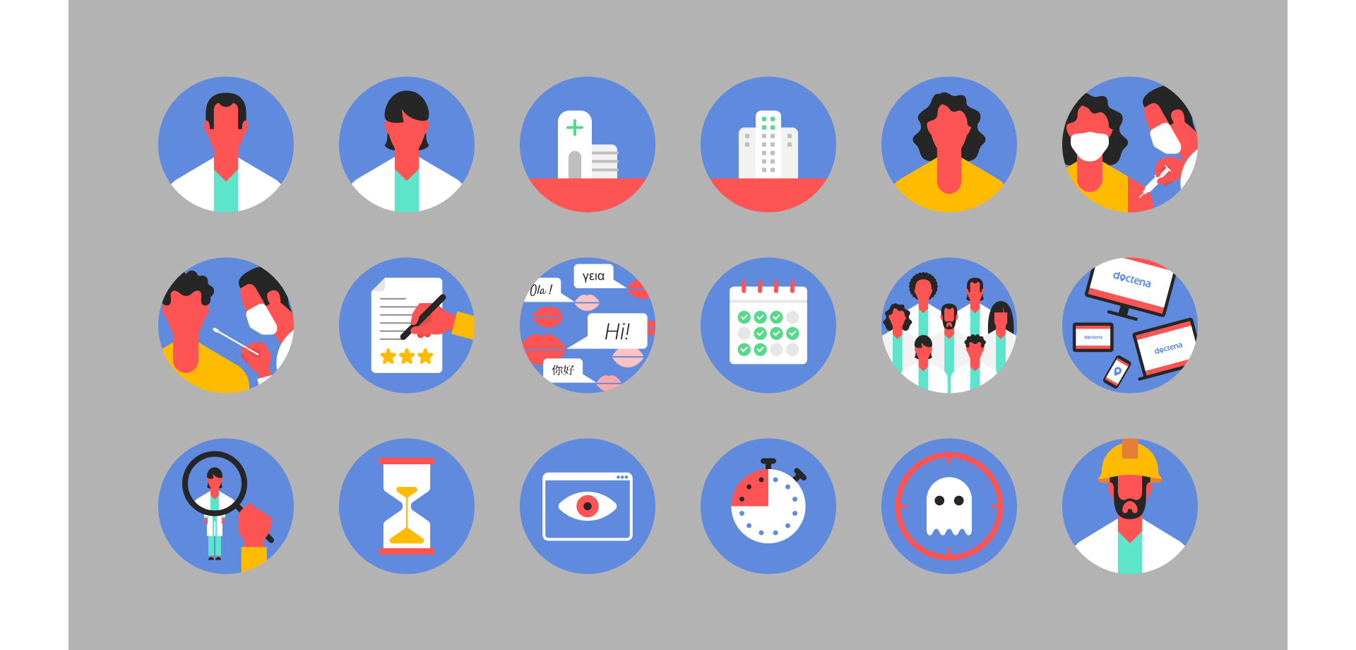
Practitioners
Patients
Onboarding Team
Government / Partnership
— ROLES
Design Leadership & Strategy
UX Research & Optimization
UI Design & Prototyping
Design System Creation
Cross-Team Collaboration
— DATE
2020 / 2025
Since the invention of the telephone, making a medical appointment has often been a hassle: choosing from unfamiliar practitioners, then waiting on the phone listening to annoying music, only to receive incomplete information. Secretaries, meanwhile, endlessly repeat details like the entry code.
Doctena understood that booking a medical appointment should be as easy as booking a hotel or a flight, and accessible at any time. The platform allows patients to directly view the practitioner’s calendar and book appointments with just a few clicks. Practitioners, in turn, can manage the availability of their team, rooms, and equipment, and set specific booking rules.
Since its launch in 2013, Doctena has expanded to six European markets and now has 4,600 practitioners across more than 100 specialties, with 1.7 million appointments per month, reducing no-shows by up to 70%.
PHASE I • ANALYSE
The team of integrators and developers had somehow managed to maintain a minimum of coherence in a flow of information, despite the absence of a Design department.
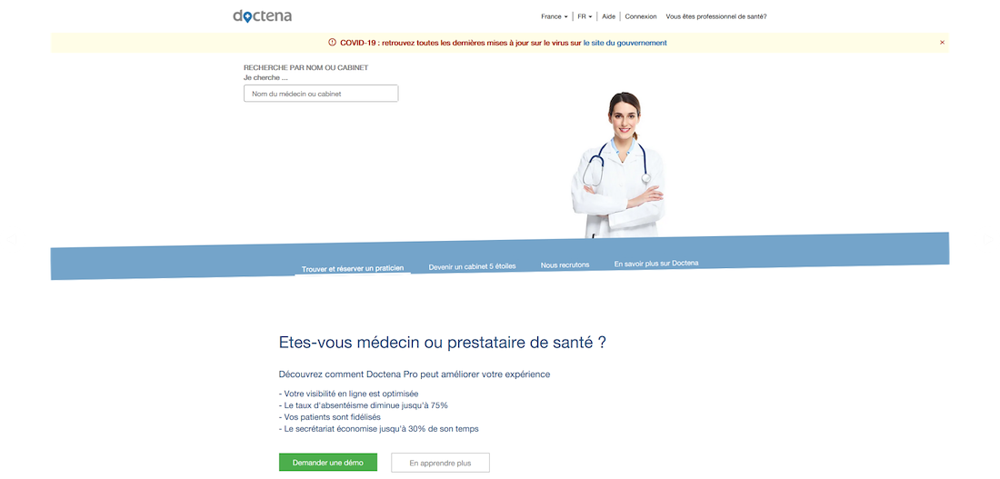
OId Patient Portal
OId Patient Portal
OId Error Page
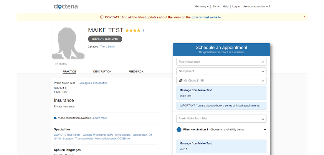
OId Practitioner Portal
OId Practitioner Portal
OId Practitioner Portal
OId Practitioner Portal
OId Practitioner Portal
OId Practitioner Portal
OId Practitioner Portal
OId Practitioner Portal
OId Practitioner Portal
So I had carte blanche to harmonize the different portals and simplify the user journey. I first gathered the existing visual identity elements, then proposed a harmonization work: adjustment of colors, logos, typography, icons, illustrations, grids, effects, and especially components. After this work, I will actively participate in the creation of new features.
PHASE II • DEFINITION
DESIGN SYSTEM
This project goes far beyond a simple aesthetic overhaul: a complete design system down to the smallest component has been developed to ensure the consistency of the interfaces, strengthen the brand image and its accessibility.
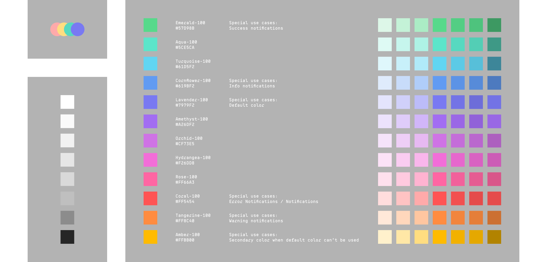
COLORS
Creating a white environment with a palette of soft, natural, mineral, and organic colors, closer to pastel tones, will evoke a sense of calm and inspire hope. This approach fosters a feeling of optimism and well-being, breaking away from the monotony often associated with the medical field.
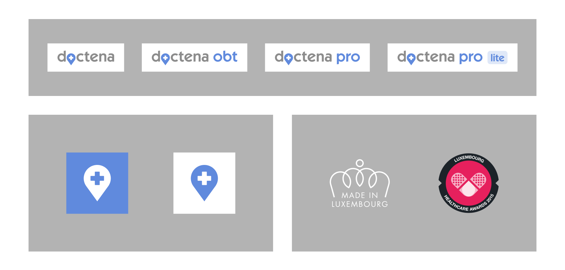
LOGO
Based on the new palette, we are moving away from the deep medical blue and moving towards a warmer shade, leaning into lavender and cornflower blue. These two plants, known for their anti-inflammatory and calming properties, are now symbols of well-being on a wide range of modern health packaging. The font has been updated to a more geometric style, allowing customization of the original logo to differentiate the various portals. Absolutely all the logos present on the site have been reproduced in vector format.
TYPOGRAPHY
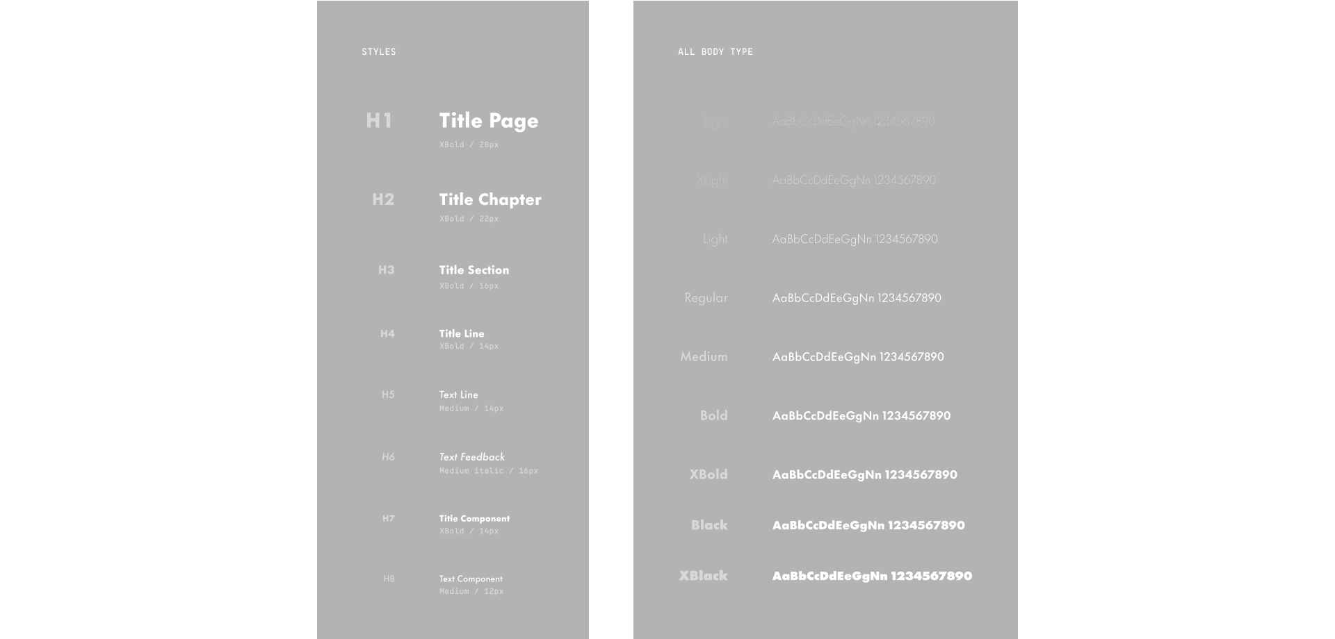
6 different fonts were used in the past between marketing and IT. A unique alternative, Futura Now, has been selected as the primary font for its optimization and ability to meet technical requirements.
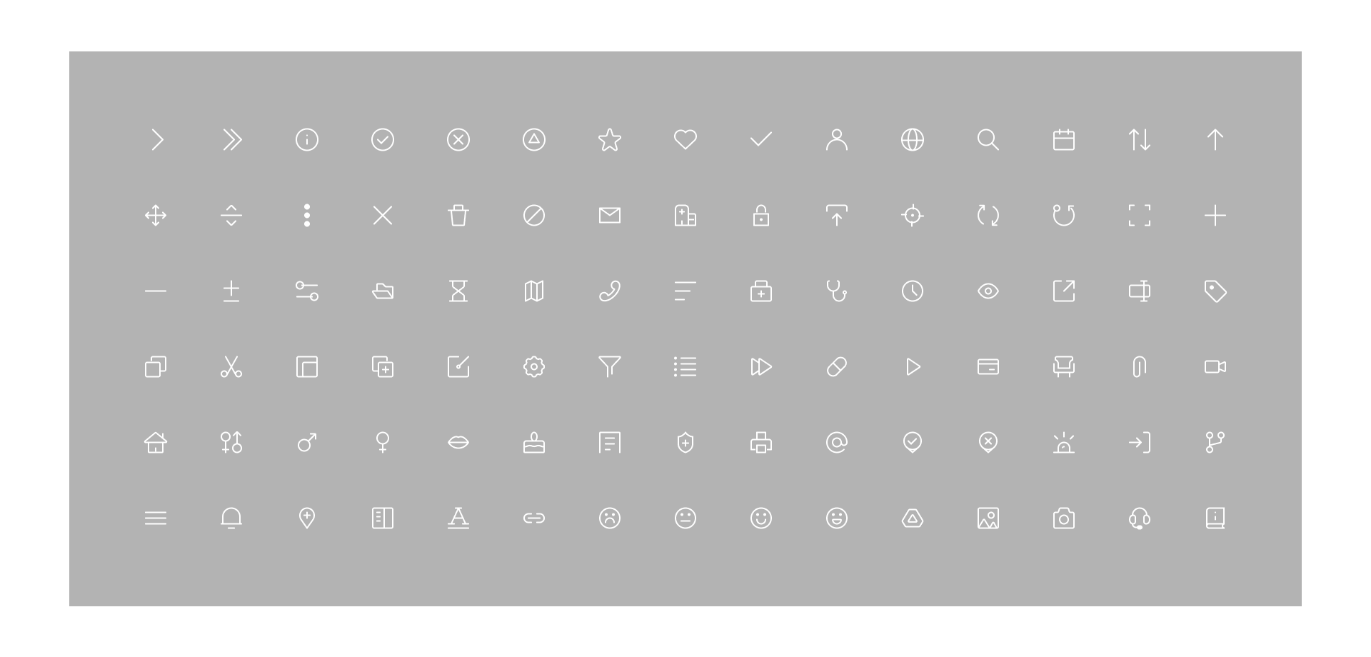
ICONS
Instead of a mix of icons of different styles, stroke sizes, sometimes including tons of dots or even bitmaps, all gleaned from free icon sets, special care was taken in creating a unique set of icons.
ILLUSTRATIONS
Instead of using standard, non-professional stock images, vector illustrations were chosen. This approach simplifies the communication of an idea, optimizes page load times, and allows for customization or animation.
GENERAL APPEARANCE
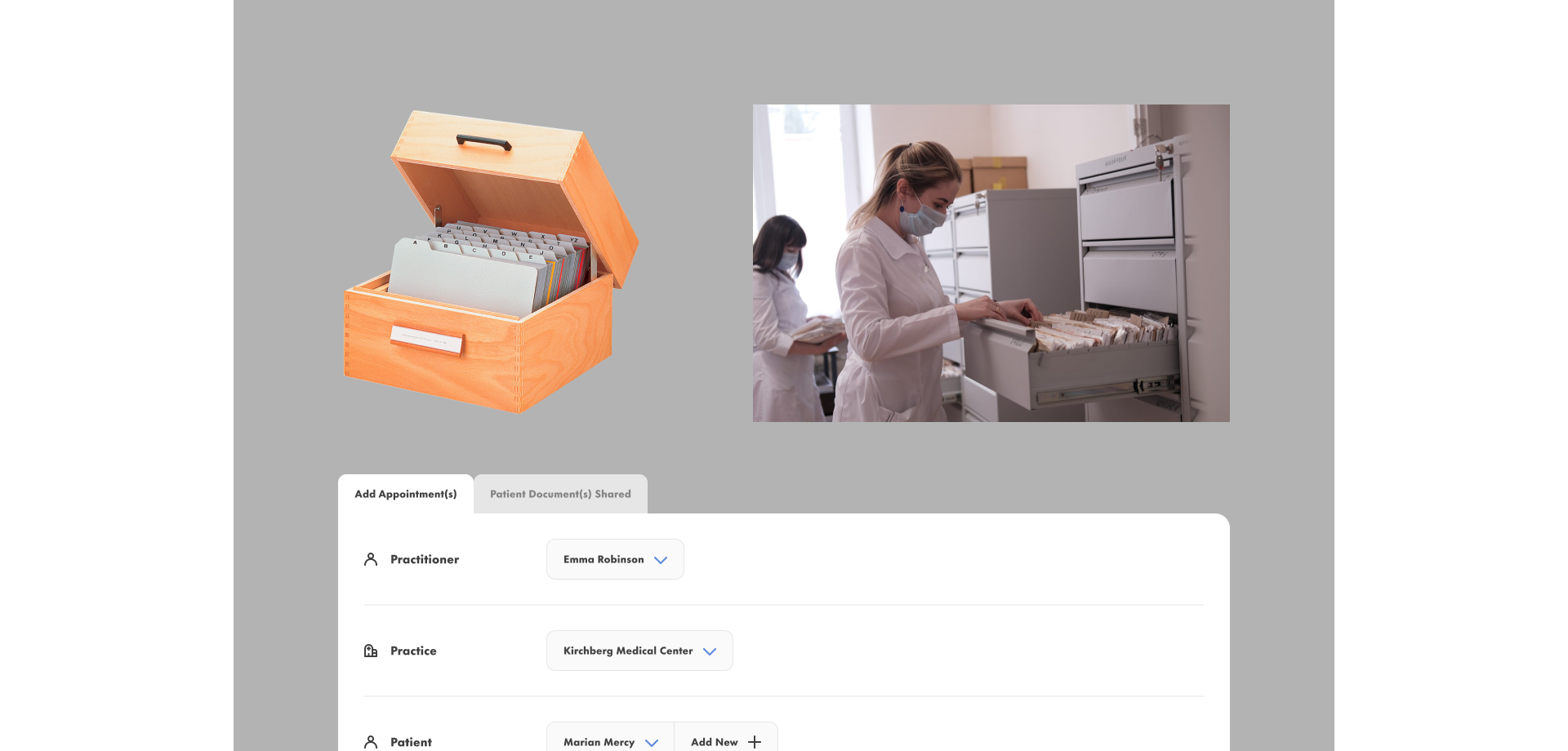
Example of rebalancing tabs while keeping a visual tradition on the storage of medical records. Making it modern does not necessarily mean forgetting the culture and history of the sector. It is about consciously integrating rather than imposing a discordant presence. Treading lightly in respect of the past, present and future.
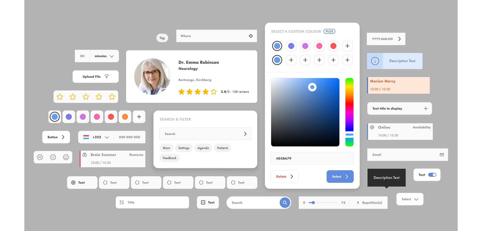
COMPONENTS & LIBRARY
8 styles for a unique modern optimized font / Instead of multiple fonts
113 color styles / Instead of mix of unrelated colors
13 vector logo / Instead of multipoint vector logo or bitmap
47 illustrations / Instead of weird stock images
382 icons with style / Instead of different styles and stroke sizes
64 reusable components / Instead of hard coded components
PHASE III • CONCEPTION
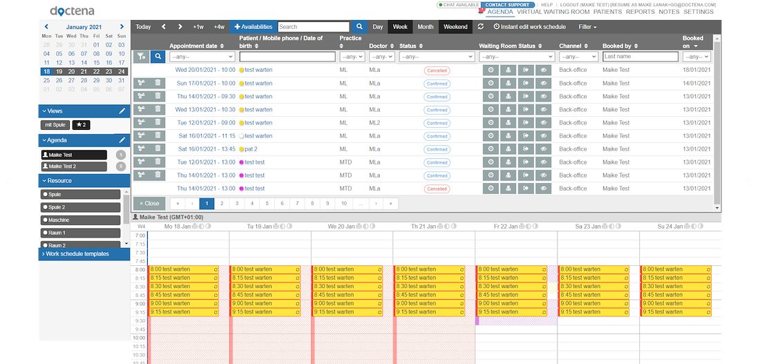
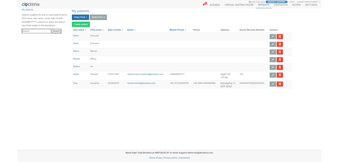
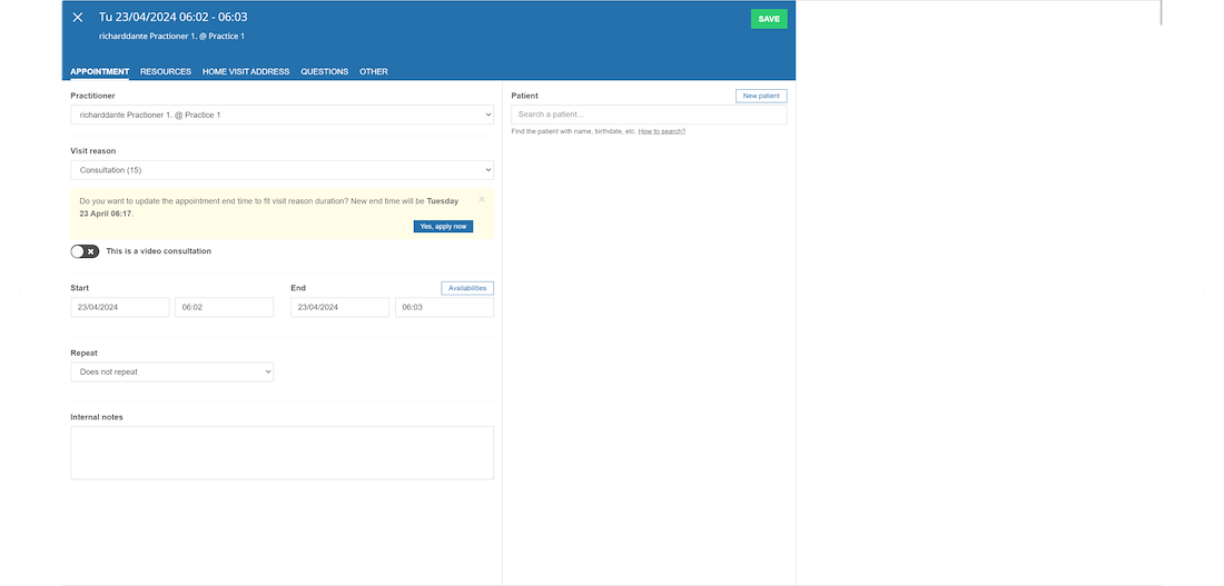
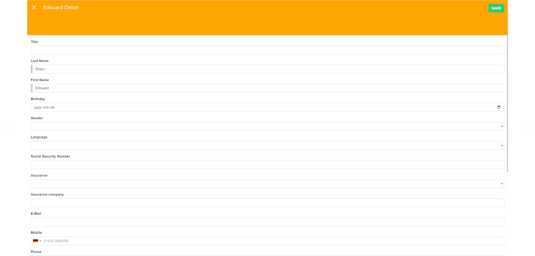
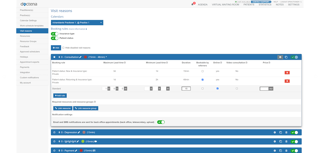
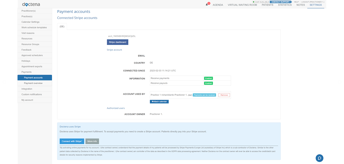
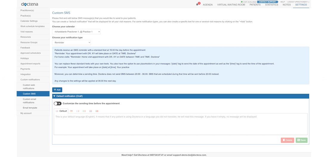
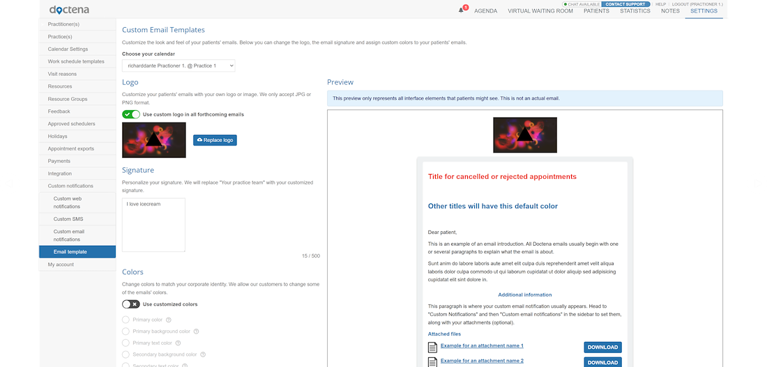
THE PATIENT / PRACTITIONER PORTAL
All pages have been reviewed and refined through a unified login system. Try logging in as you would on a real site, or use the left panel to navigate between the Patient and Practitioner portals.
SPECIFIC BEHAVIORS
Some solutions require more explanation.
Here are examples of specific cases to assist the integration team

ERROR PAGE ILLUSTRATIONS
TEXT LANGUAGE SELECTOR
The practitioner can use different languages to speak to the user. The fields filled in will be automatically translated according to the language the patient has chosen.
NEW LITE APPLICATION
Focused on the core objectives of the solution. A streamline interface, with some features removed, providing direct access to the dashboard, calendar, and patient list.
RESEARCH
This section helps keep track of missing or to-be-reworked features.

Here’s a concrete example for “Notes”, used for communication between practitioners.
The main issue raised was the prioritization of information.

Practitioners were sending messages to themselves, using the page as a task manager.
The solution was to provide them with a more user-friendly Kanban-style interface.

A complete redesign of email communications.
IMPACT ANALYSIS
Rework of UI/UX of 3 platforms / 6 Special accounts = 151 pages
Completely restructuring and aligning with the true definition of the settings and main pages
Reorganizing through logical grouping of features for each page and menu
Enhancing error handling and recovery mechanisms
Adding more user assistance, guided tours, and search bars
Minimizing the emphasis on optional elements
Integrating missing and new features
Implementing new UX wording
Introducing a streamlined header and menu design on main pages and settings
Panels like filters, map, and main menu now display without obscuring content
Ensuring genuine responsiveness
Improving accessibility
Enhancing performance
Ensuring consistency across various platforms
Enhancing brand representation
Reducing cognitive load
Simplifying overly technical aspects or removing unnecessary features
Facilitating a natural user flow
Incorporating modern components
Integrating community feature requests
Providing more options for personalization
Improving data visualization